Marketing Strategy, Creative Development, Branding, Graphic Design, Web, Copywriting, Media strategy + placement, Video Production, Audio Production
Omaha home for boys (OHB)
To celebrate OHB’s 100-Year Anniversary, we gave them a full rebrand and logo, a new tagline — “Transform a Life, Strengthen a Community” — a new website and fresh videos. Then we launched a year-long media campaign to share inspiring stories and illustrate how this organization changes lives.
In the OHB logo the letters are affixed together to symbolize what they do: connect. Connecting a young man with higher education through a scholarship program, connecting a single mom with an interview outfit, or connecting a struggling family with mental health care.
Also seen in the OHB logo are the rungs of a ladder on the “B.” Again this is a symbolic element of their mission. When youth, young adults and families seek the guidance of OHB, they are typically at a point in their lives that is filled with numerous obstacles to success. OHB helps these individuals overcome their challenges to reach the next rung on their ladder.
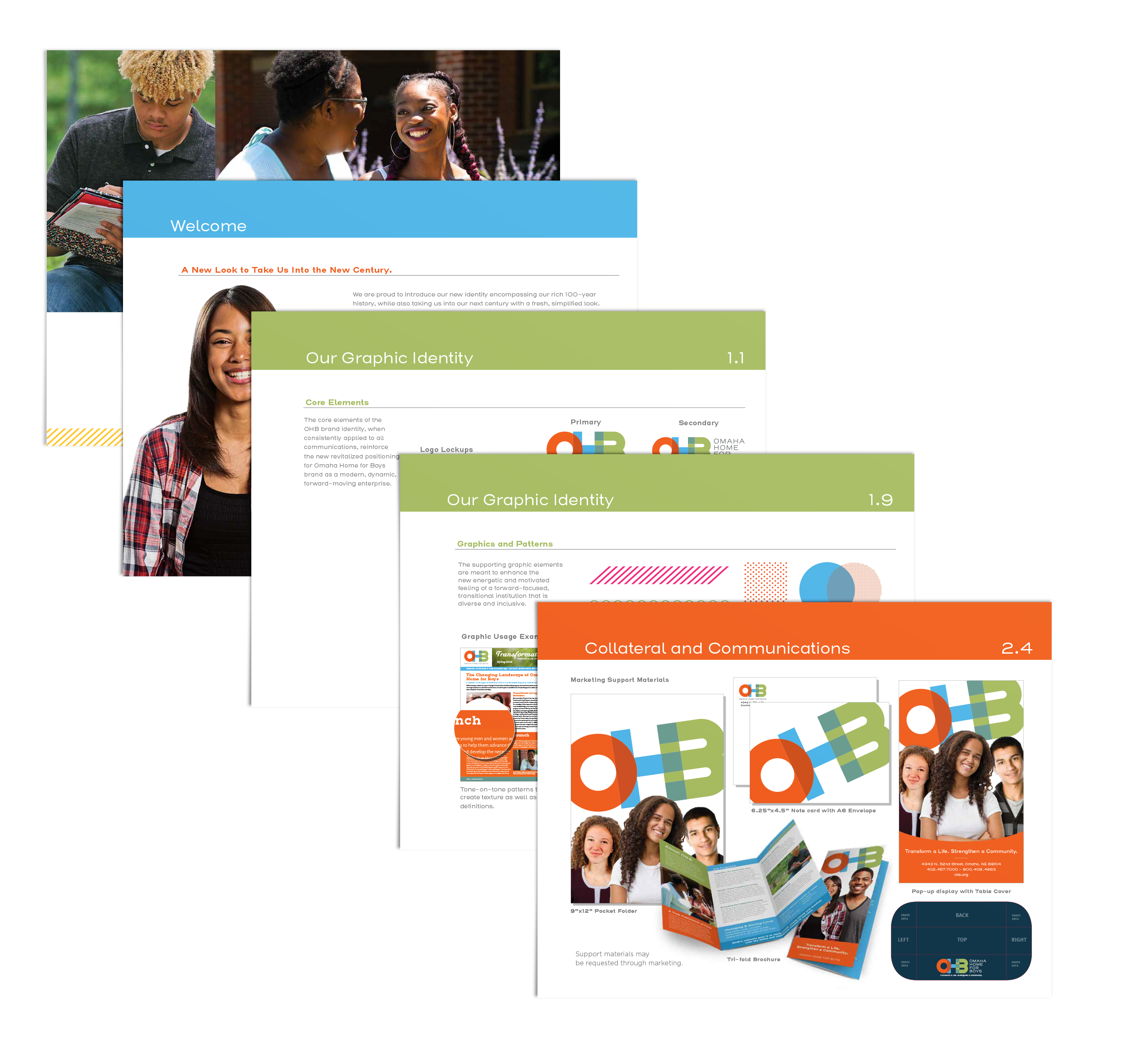
OHB is a diverse and inclusive institution. We chose the color palette to match and exude this feeling. Non-binary and gender non-specific colors were selected to represent all individuals OHB serves.
color palette
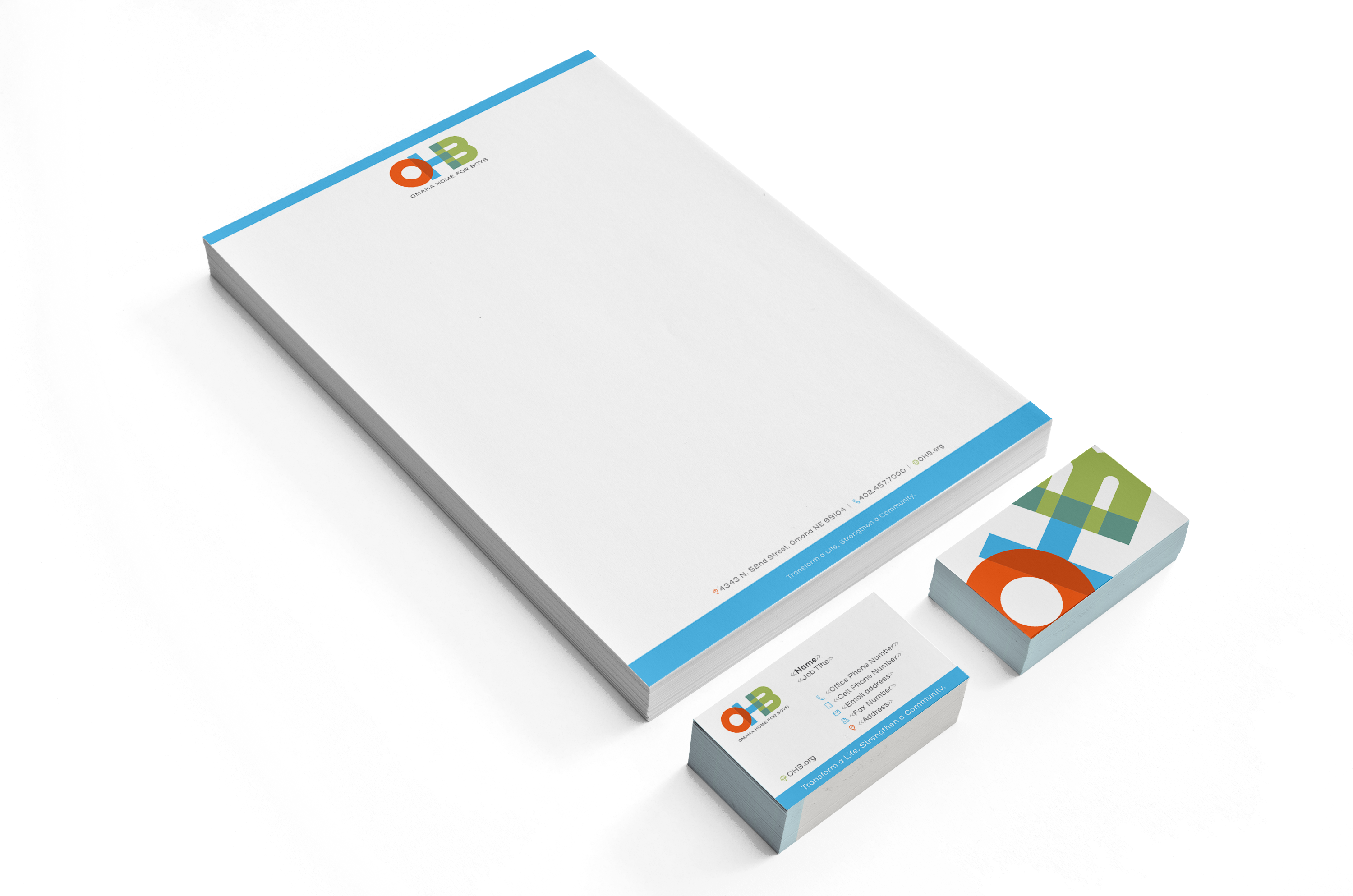
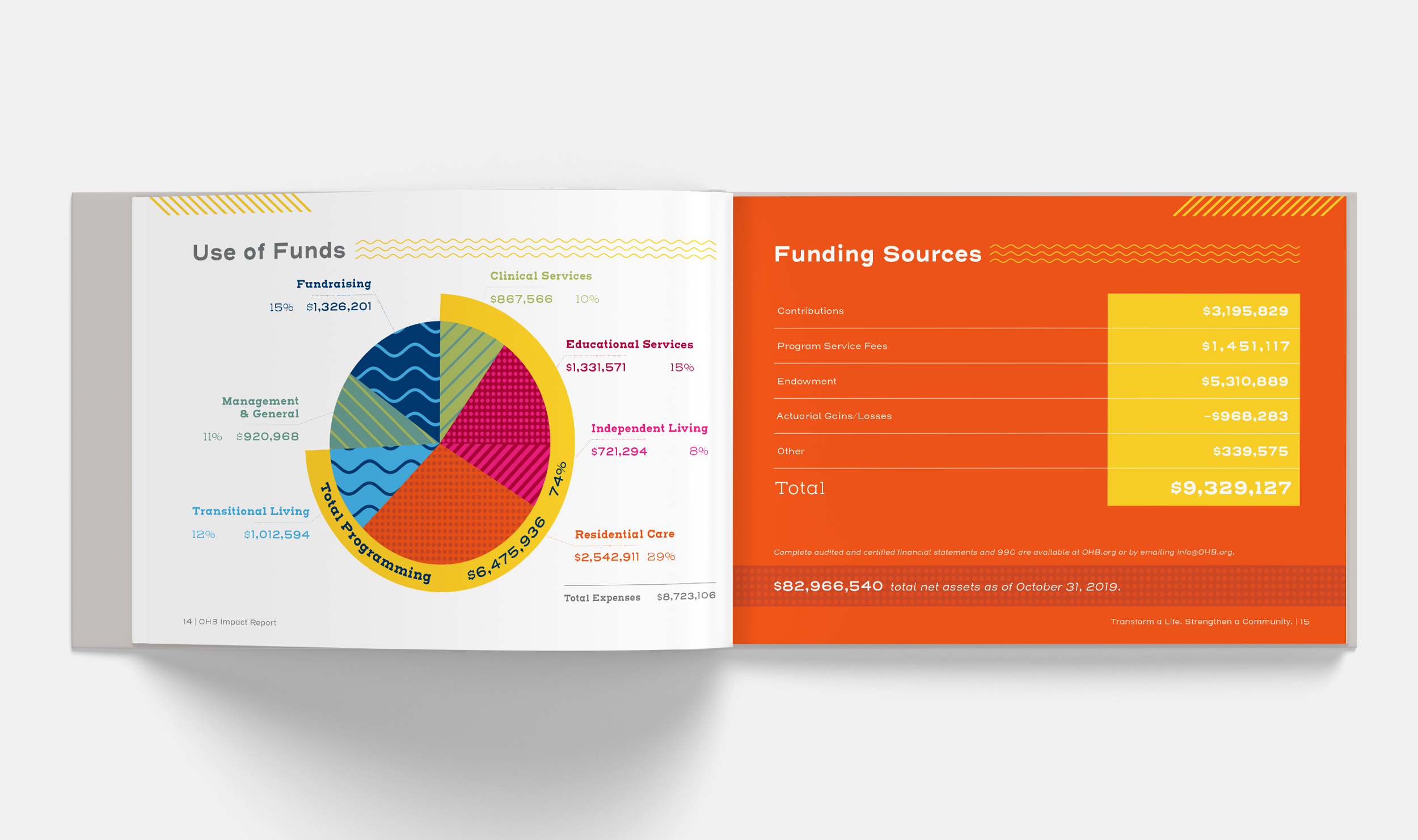
the campaign
100 years of ohb
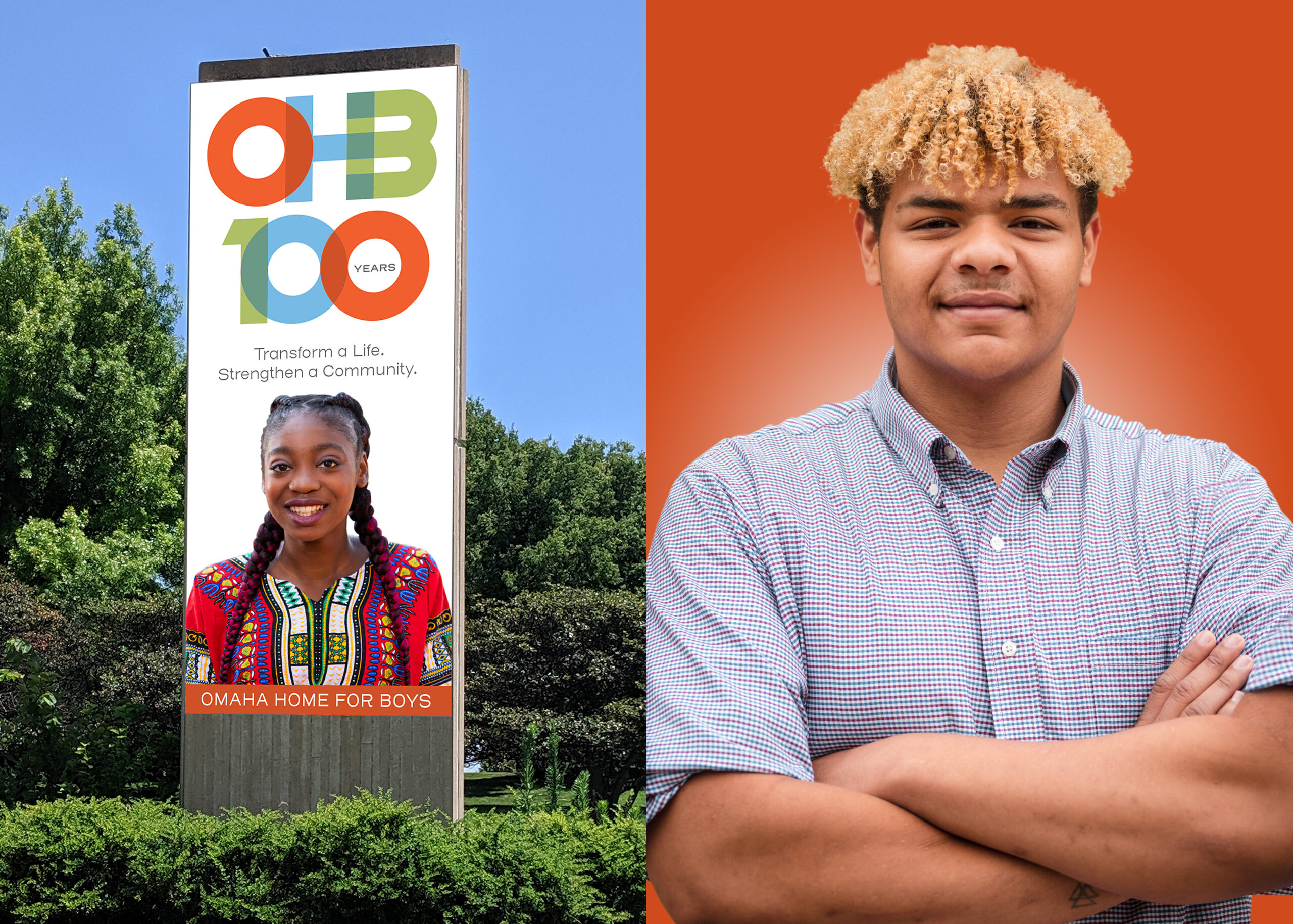
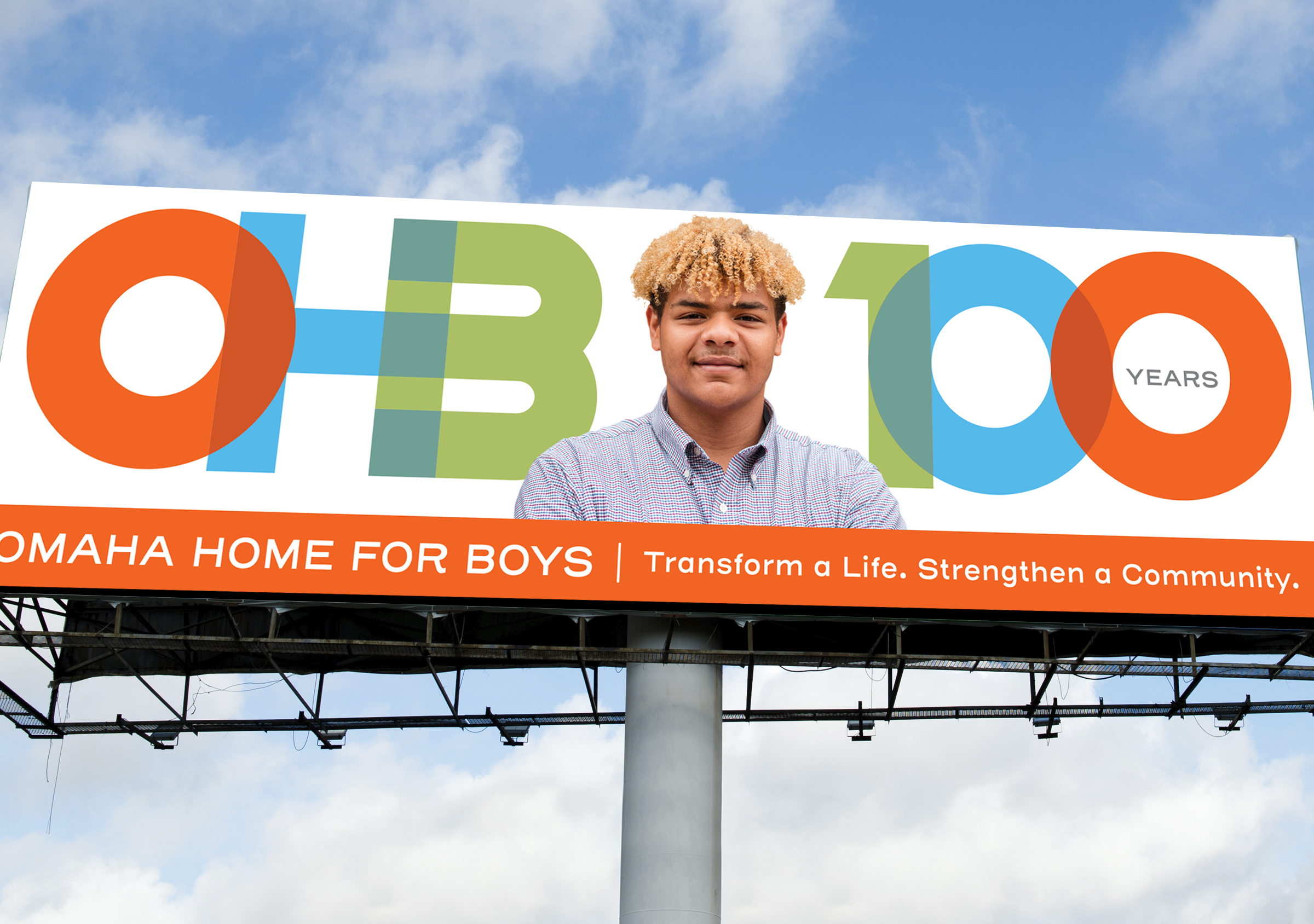
outdoor ads + photography
the website
gender neutral messaging
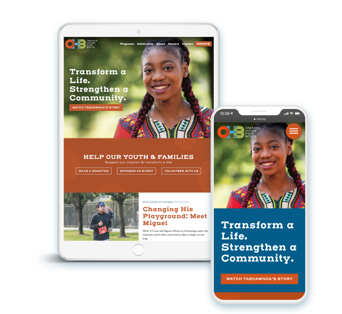
responsive web design
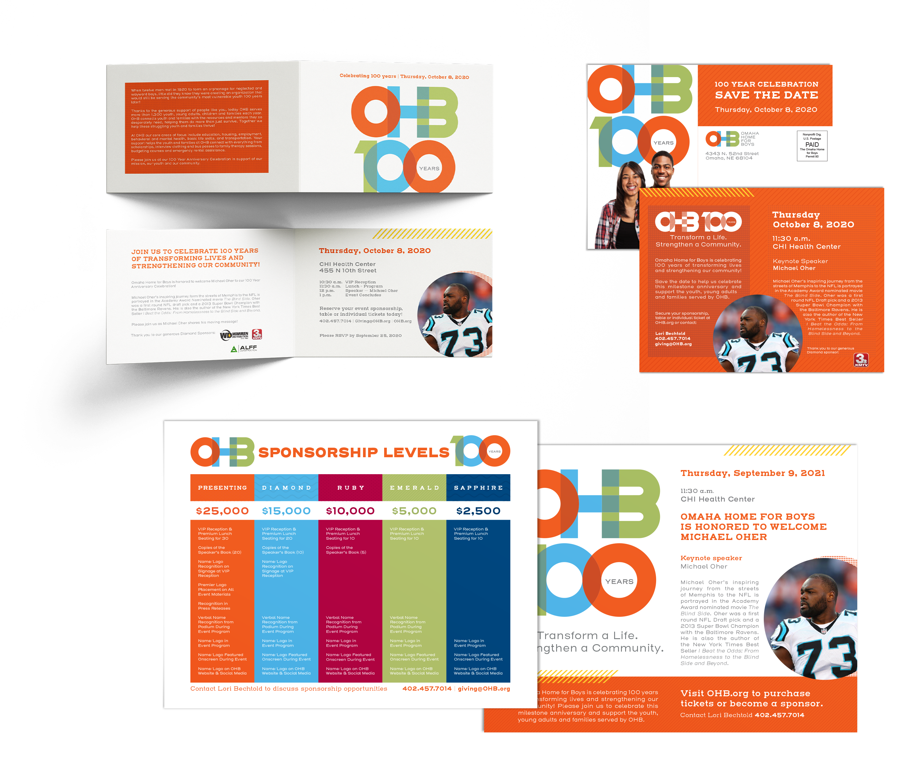
events collateral
haulin’ bales
fun run
